

Background:
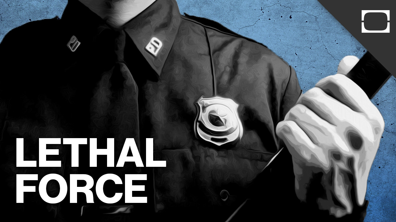
This particular vertical of Discovery Digital Networks (TestTube) deals primarily with current events and offers viewers an opportunity to demistify global (and local) ongoings through concise, informative videos. The videos are hosted on Youtube, several news and media outlets (MSN, AOL, Hulu, etc) and Discovery's owned and operated site. During a contract position with Discovery DN, I was offered the opportunity to redesign and templatize the look and feel of the thumbnail/header graphics for this set of videos.
My Role:
I effectively took complete ownership of this project, under the guidance and approval of the production team. I was responsible for sourcing images as needed, composing/altering them and the ultimate design of the final thumbnails. I also had the opportunity to come up with the title phrases overlaid on each graphic. I was then responsible for training the Associate Producer to create new versions of the thumbnails using the methods I put in place. This involved creating a template and a set of photoshop actions that allowed them to maintain the look and feel of the images as they created them.
My Process:
The design began with the determining the focal point of the video through review of the script and a discussion with the Producers of the show. What followed was a series of comped images that reflected a lower-quality version of where they would eventually end up, all done in Photoshop and occasionally hand sketched in prior versions. The last step of the process involved bringing in the controlling parties to review a semifinal version prior to export.
Success:
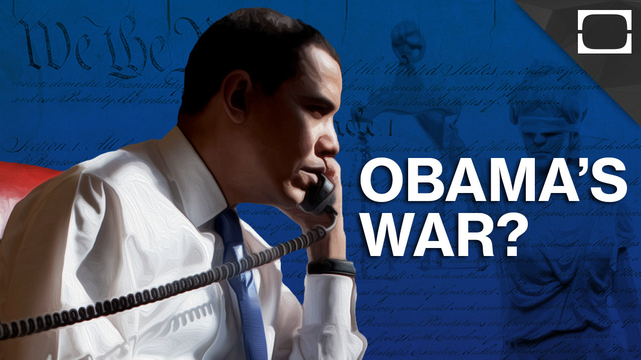
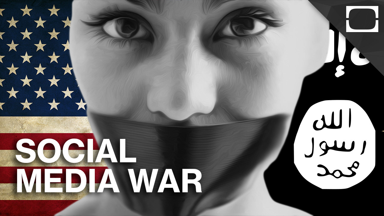
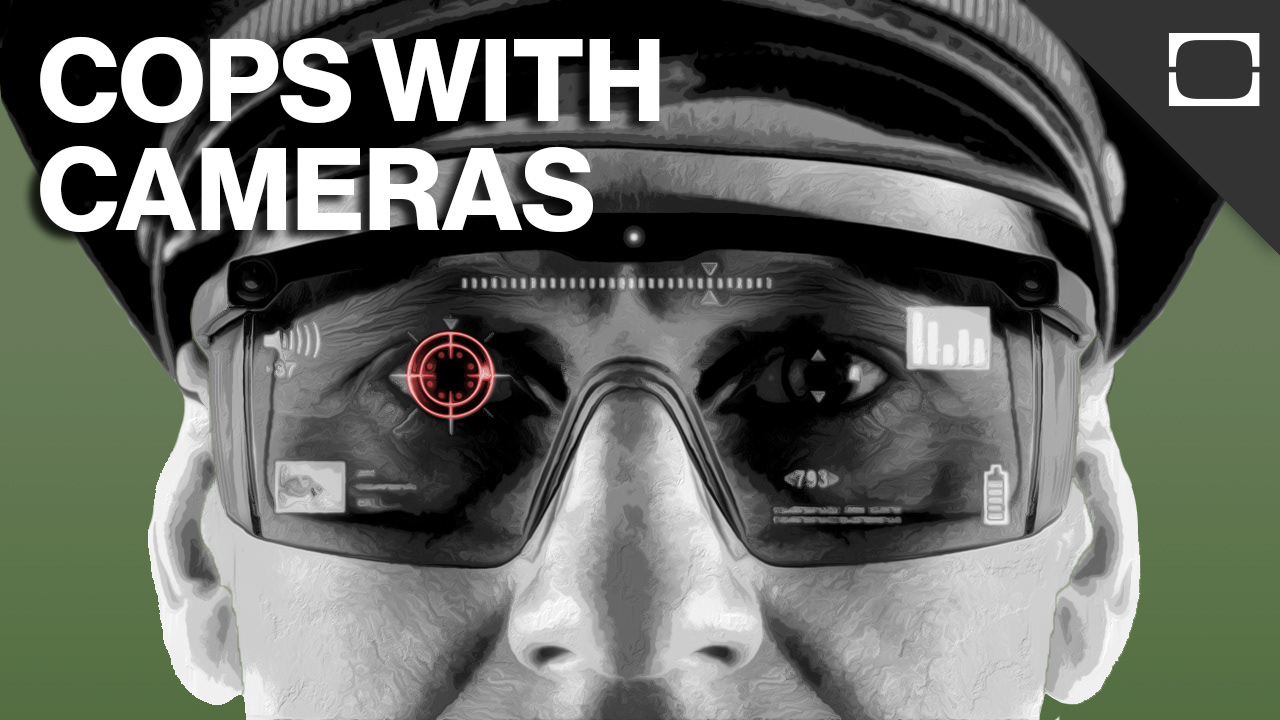
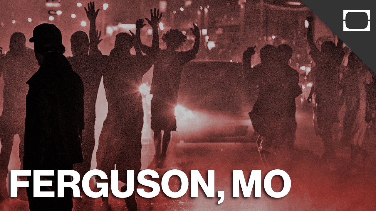
The new thumbnails have become a focal point in the promotion of the show and have contributed to an up-tick in the show's popularity. The project has, at this point been passed along and the show's Associate Producer, with great success. The greatest sucess of these individual images lies in how the concept of each video has been distilled into a minimal format without losing the show's focus.
Looking Back:
While these images have been successful, some of them tended to be a little on the dark side of the color spectrum. I think some of the earlier images could have been improved by lightening the palette a bit. I also would have included a textured background in some of the ones that only have a slight gradient. Overall, though, I am happy with the outcome of this project.